Introduction
Python is the most popularly used programming language by Data Scientists that help them in conducting different operations and tasks from simple scripting to complex web application development and data analysis. It’s simplicity, readability and vast range of applications makes it a versatile language.
Python’s syntax is easy to understand and makes it an excellent choice for beginners to learn and develop their programming skills. The presence of a large number of Python libraries and modules makes it highly efficient in conducting data analysis.
Tabulation is a process in Data Analysis that makes use of Python programming for effectively conducting analysis of a large number of datasets. The following blog will help you understand the process of tabulation of data in Python.
Types of Tabulation:
Tabulation is a crucial process in data analysis, involving the organization and presentation of data in a structured tabular format. This approach offers numerous benefits, including enhanced readability, efficient data comparison, and the ability to uncover patterns and insights that might be otherwise hidden in unstructured data.
The choice of tabulation technique depends on the nature of the data, the analysis goals, and the intended audience.
Basic Tabulation:
At the heart of tabulation lies the creation of basic tables, where Data is arranged into rows and columns. This technique is ideal for presenting straightforward data, such as lists of items with their corresponding attributes.
For example, a table displaying the names, ages, and locations of individuals can be easily created using basic tabulation. This method is the foundation of more advanced tabulation techniques.
Aggregated Tabulation:
When dealing with larger datasets, aggregated tabulation becomes invaluable. This involves grouping data based on specific attributes and calculating summary statistics for each group. Aggregated tabulation is particularly useful for analyzing trends and patterns within distinct categories.
For instance, one might analyze sales data by grouping products based on their categories to gain insights into the most successful product lines.
Pivot Tables:
Pivot tables take tabulation to the next level by allowing data to be rotated, turning rows into columns and vice versa. This dynamic technique enables more complex data summarization and comparison.
A common application of pivot tables involves multidimensional analysis, such as evaluating sales performance across different regions and product categories simultaneously.
Multi-Index Tabulation:
As data complexity increases, multi-index tabulation comes into play. This technique involves creating hierarchical tables with multiple levels of indices and columns. It is particularly valuable for managing intricate datasets where data needs to be organized and presented in a structured manner.
Multi-index tabulation is commonly used in Pandas DataFrames to represent multidimensional data, making it easier to access and analyze.
Cross-Tabulation (Crosstab):
This technique is employed to understand the relationship between categorical variables. Cross-tabulation involves creating a contingency table that showcases the distribution of data across different variables.
By examining the intersections of these variables, analysts can uncover patterns and correlations that might not be immediately apparent.
Time-Series Tabulation:
For data with a temporal component, time-series tabulation is essential. This technique focuses on arranging data chronologically to analyze trends and changes over time. Time-series tabulation is widely used in financial data, sales reports, and any dataset where understanding temporal patterns is critical.
Interactive and Visual Tabulation:
As technology advances, interactive and visual tabulation techniques gain prominence. Interactive tables allow users to filter, sort, and explore data dynamically, offering a more immersive and personalized analysis experience.
Visual tabulation involves representing tabulated data through charts, graphs, and plots. These visualizations make complex data more accessible and understandable, aiding in the communication of insights.
Customized Formatting:
Regardless of the chosen tabulation technique, customization plays a significant role. Adjusting column widths, colors, fonts, and adding styling can significantly improve the visual appeal and comprehensibility of the table.
Customized formatting ensures that the table aligns with the presentation requirements and effectively communicates the intended message.
In conclusion, the world of tabulation is diverse and rich, offering various techniques to suit different data analysis needs. From basic tables to pivot tables, aggregated tabulation to interactive visualizations, mastering these techniques empowers analysts to effectively dissect and communicate insights from raw data.
How to create a Table in Python?
Creating a table in Python involves organizing and formatting data in a tabular structure. There are several ways to achieve this, and I’ll provide you with two commonly used methods: using lists and loops, and using the tabulate module.
Method 1: Creating a Table Using Lists and Loops
In this method, we’ll manually create a table using lists to hold rows and loops to populate the data.

Method 2: Creating a Table Using the tabulate Module
The tabulate module is a powerful tool for creating tables with minimal code. You’ll need to install it using pip first:

Once installed, you can use it to create tables easily:
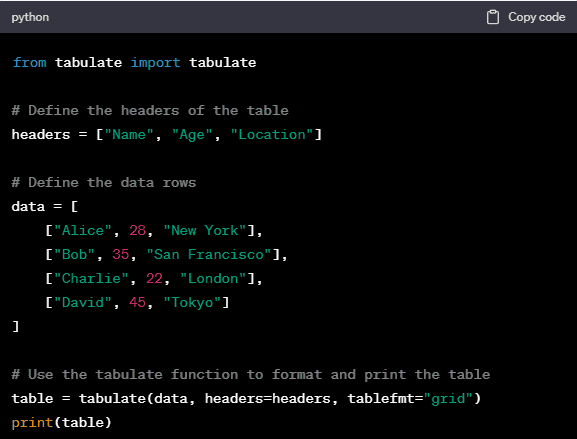
The tablefmt parameter in the tabulate function specifies the format of the table. You can explore different formats like “plain”, “html”, “pipe”, “orgtbl”, and more.
Remember that the tabulate method is especially useful when you need to display data in a tabular format quickly, and it handles the formatting details for you.
Both methods allow you to create tables in Python, but the second method with the tabulate module provides more flexibility and options for formatting and customization. Choose the method that best fits your needs and coding style.
Conclusion
In conclusion, we have provided you with an in-depth knowledge on how to tabulate data in Python. Following the above steps will definitely help you in conducting data analysis in the most significant manner.
Furthermore, if you are a Data Science aspirant you can enroll yourself with Pickl.AI’s Data Science course where you can learn these techniques effectively.